Tuesday, December 31, 2013

January at Archiscraps

HAPPY NEW YEAR EVERYONE!!!

January 26th is Australia Day.
One of our DT has requested Australian buildings, so here is a famous one.
JANUARY's picture.
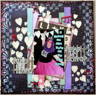
The extra criteria will be something musical. Either use sheet music or think up something else like a song title, musical notes etc.
This satisfies Jane's request to use local buildings and should be an easy one for most of you.

The extra criteria will be something musical. Either use sheet music or think up something else like a song title, musical notes etc.
This satisfies Jane's request to use local buildings and should be an easy one for most of you.
Perhaps you can let the curves of the Opera House inspire you.

Here are the DT's layouts.
                                                 LIBBY
Layout is titled, "Bravo!"
 

Our son and his best friend marching in the Memorial Day Parades.

The criteria is to use something musical.  The large pp circle has music notes on it, music notes ribbon, clear music notes stickers, glitter foam musical note and the musical instruments in the photo too.
I used blues and white as inspiration from the photo and I thought the banners mimiced the design also.  The smaller circles under the photo and the banners were embossed.  Glitter paper is DCWV.  Sketch is by Jana Eubank.
                                                      

                                                                    JANE


Sydney Opera House actually got me to thinking about our own white sails on a unique building where I live.  My daily drive past Brisbane Waters would not be the same without this sight.  I’ve paint stamped part of my white cardstock base and then added in strips of patterned paper (one of them music notes to fit the criteria) as well as using washi and string.
                                                               DEBI


Here is my January LO based on our fabulous icon of the Sydney Opera House...an amazing building, and everyone seems to know where it is!


I have based my page on the sails & used a photo of my Pete on his windsurfer, ready for a speed sail on the beautiful water of the Clarence River at Yamba.
                                                                   TRISH


The Angel corner die reminds me of the opera house sails and the music is obvious albeit upside down.

No I haven't been into the champagne yet!,
                                                                 SUSAN


Here is my layout for January. My niece loves music so I based the layout about her. I used the scallop edge of the doilley and punched the bottom of the layout to create the peaks like the Opera House.
                                                                   DALE


My layout is about my son's ensemble competing in a competition. The background page is my nod to the Opera House with all the different angles shooting upwards, plus there are notes and piano keys on it. I have also added some music washi tape.

                                                                   NICOLE


I was inspired by the colours of the photo. The blue of the ocean and the white of the Opera House.


Our sponsor this month is Shop and Crop http://www.shopandcrop.com.au/
There will be a code for the winner to spend at the store & choose what you like.
 
************************************************************************************
Our winner for DECEMBER was Debi Tehrani
The gorgeous items from Scrapping Clearly will be posted to you soon.
And thank you again to Kylie Tout for her generous donation.

Thursday, December 5, 2013

Counterfeit Kit joint venture with Archiscraps-Christmas challenge

Over at Counterfeit Kits we are having a Christmas challenge each day.
Counterfeit Kit Challenge


Today's challenge is to complete the December Archiscraps challenge.(5th December)
>>>>>>>>>>>>>>>>>>>>>>>>>>>>>>>>>>>>>>>>>>>>>>>>>>>>>>>>>>>>>>>
As well as linking up your layout on here, you can also link it on Counterfeit Kits Mr Linky for December.
 For details check the previous post.

Saturday, November 30, 2013

December at Archiscraps

Firstly, our kind sponsor this month is Kylie Tout from Scrapping clearly


She is the largest stockist of Heidi Swapp items in Australia, and her acrylic albums are wonderful. They come in all different shapes

They can be used with other papers and embellishments to make a gorgeous mini book.
****************************************************************************
Here is the prize, some gorgeous Heidi Swap bling plus chevron bags.
I've also added some acrylic blocks (not shown) which can be used for mounting clear stamps.


Our challenge for this month is an easy one.

 Do any Christmas layout with a Christmas embellishment

Here is a gingerbread house in Savannah,Georgia (USA) to inspire you
Why am I tempted to talk like Scarlett O'Hara?
*****
The ladies have produced these beautiful layouts.
DEBI
 
I had this photo of a Gingerbread House that a friend made, & one a bed of Kraft, pp, CS & washi, I adhered my little photo.  With some additions of a few embellies & words, I am really happy with my page.
LIBBY
 
                      
Layout is titled, "Dream."


This is our son, sleeping under the Christmas tree.


The criteria is to use a gingerbread man or other Christmas food theme.  I used a gingerbread man rub on.  Brown pp was added as inspiration from the photo as well as the rosettes which mimic the design on the house.  The ink drips reminded me of the banisters on the house also.

The tag was embossed and ribbon stapled at the top.  Twine was threaded through the buttons and tied in a bow.  Home made mist was dripped under the photo and the rosettes are also home made.  A tiny strip of glitter border was added through the center, under the photo.  Sketch is Page Maps (Apr 2010).


                                                                      TRISH


I think the die I have used on top of the cake looks like the pointy bit on the top the house and the fence also.

Not your traditional colours either  but I loved the paper and as there is a pool in the background was trying to match that.
                                                              JANE


This is how I make a Christmas layout with literally no Christmas supplies on hand other than a short piece of ribbon, one leftover tag and a forgotten piece of patterned paper from my scrap box.  The rest are normal products from my stash.  It can be done .
  My journaling reads ... “Making a gingerbread house is not only a sweet treat, it can be a finger-licking occasion”.  Amen to that!
Wishing all our supporters a wonderful Christmas – may you travel safe and be happy ! 

                                                                      SUSAN
 
Christmas means family & home to me so the "house" was the basis of my layout. Of course the gingerbread just had to be the colour for me! The cork piece reminded me of gingerbread.
                                                                                DALE


I took the colour cream of the house and chose my background paper because of it. The paper also has some foilage peeking in on the right hand corners like the inspiration photo. I have a gingerbread house in the photo and a gingerbread patterned paper as well. I decided to cluster everything around the photo. As the boys were wearing pink hats I took the opportunity to use a piece of cute reindeer pink paper. I've also made a pinwheel.
                                                       NICOLE


 Took this photo of the boys a few years back when it was really dry here in Queensland...I thought it totally represented the typical Aussie Christmas. My embellishment is the holly chipboard above the photo. I painted it up with green paint then smudged in some brown and light green. After rubbing some Inka Gold in gold over it I then painted the holly berries with red nail polish (yes nail polish) and put spread some antique dimensional magic over them to give them the shine. I did the title the same way using the nail polish :)


Our winner for NOVEMBER was LIZ HOCKING with Belinda running a close second.

IMPORTANT ANNOUNCEMENT
Overseas entrants please note that prizes will only be sent If you pay the postage.
Australia and New Zealand winners prizes will be posted for free.
This is owing to the increasing cost for posting parcels to the UK,USA, Canada etc.
I hope this doesn't discourage you from entering. We still love to see your work.

Finally, wishing everyone a happy and blessed Christmas.
I'd especially like to thank my Design Team girls at this special seasonal time. The effort you put in is very much appreciated.

Wednesday, October 30, 2013

November Challenge


I call this the giant olive or sea cucumber. In fact I don't know what it is meant to be.
I thought it might spur your imaginations as it is an interesting shape.

The added criteria this month is THE SEA.
 You can use any seaside picture so long as you can explain how this inspired you.

Here's what the D.T. have done ...

DALE


The criteria to go with the image was the sea. This year my family visited the Sentosa Aquarium where there was this enormous cylindrical aquarium filled with tropical fish. I've cut the sea plants with a decorative 12" trimmer and some scissors.

 
Libby
 

I was inspired by the blues in the Inspiration photo and used a "sea theme" for the criteria.  The darker blue pp was misted with a silver mist which was also inspired by the dusky, silvery-looking colors in the photo.  The tiny strip of washi tape (under the 3D dolphin) was cut with pinking shears along one edge.  3D swirls behind the dolphin look like splashing waves.  The center strip of pp was embossed and the date was added on the folder tab in the lower right.  Clear stickers serve as the page title (with a punched star on it) and sub title.  Sketch is Page Maps (Apr 2010).


JANE

 
This building looks like a sea creature rising from the waves (well if you use your vivid imagination it does lol)  so I went with a photograph my daughter captured of the performing dolphins at The Porpoise Pool in Coffs Harbour.
 
Aren't they magnificent, beautiful creatures?  I've added in some symbolic waves and a number of sea style embellishments to fit the theme.
 
 
TRISH
 
 
This is a photo of my DGS when younger, I though the title apt with the look on his face.  The tulle flower reminds me of the purple ... I shall call it a gherkin for want of a better name.  The cheery Lynne die I doubled the cut out that resembles the pattern of the gherkin shaped building and finally the die cut under the bottom picture is another example of the shape of the building.
 
 
SUSAN
 
  
When I saw the picture I thought of a big fish net so I built my layout from that idea. The background is meant to reflect the water.


DEBI


I use the 'sea' theme here on my LO using some photos of how they launch boats from the Jetty on Norfolk Island.

It really is an interesting thing to watch as a car, winch & the boat is involved then off goes the boat for some recreational fishing.
I used some hessian, & woods with my photos to sure up the Jetty and give a maritime feel.
 
NICOLE
 
 
The first thing that struck me about the building, besides the fact that defies gravity in an awesome way, is the diamond pattern. So I used that on my page in several places. I also used circles and circular patterns to represent the "hole" at the top of the building. The colours on my page I took from the photo of 2 of my boys exploring the rock pools at the beach.


AND HERE IS THE PRIZE ....


Just in time for Christmas crafts you can win 20 sheets of 12x12 Christmas patterned paper plus Ruby Rock-it Border Sticker (10 pennants) and Ruby rock-it Glittered layered accents (17 pieces).Both the Ruby rock-it items co-ordinate. These are kindly donated by me.


So come on & join in the fun at Archiscraps.
I'm sure you all can create one.


Monday, October 28, 2013

Anyone else entering?

You have just under 2 days to connect your entry via inlinkz to our blog.If there are no further entries by then I will declare Angela the outright winner.
Keep tuned for our November inspiration,it is one you will all have something for.

Monday, October 7, 2013

October challenge.

                                                     
Well October is well and truly here and in order to get back to the beginning of the month for challenges, this will be a short month.

 This challenge is from a friend's photo taken in  Europe earlier this year.

 
The extra criteria is a face somewhere on your layout. It can be in the photo or on the embellishment somewhere. You can use these colours or any other that you like.


                                                                    LIBBY


The criteria for this challenge is to "add a face" on your page... which is "traveling girl" to the left of the photo.  I was inspired by the colours in the inspiration photo as well as the metal design.  I used orange and black papers and added spiral metal clips and a punched border which also reminded me of the architect in the photo.  Various stickers are layered and clustered beside my photo and below it.  Sketch is Page Maps (Apr 2007).

 
                                                                         JANE

 
I was drawn to the intricate wrought iron work shown in the inspiration picture.  It reminded me of some of the amazing fences and gates I saw on stately homes and castles of the United Kingdom and across various countries of Europe.  The ones I settled on using were at Buckingham Palace in London.  These were designed by Sir Thomas Brock for King George V and Queen Mary in 1911 so are now more than a century old.  They display the Royal Coat of Arms of the United Kingdom - the lion representing England and the unicorn, Scotland.


                                                                                DALE


I have the criteria of faces in that my photo shows only faces. I have also used the colour scheme of white, black and orange. I have a lot of black swirls too. I've added bling as the background paper is quite glittery, the alphas have rhinestones and I have added two flourishes made of rhinestones as well.

 
TRISH
 
 
My grandchildren were lucky enough to go to China last year.  Here they are posing in the copies of the warriors.  I used deco crackle on the urn and leaf, rubbed with gold paint over that when dry with my fingers for more control.  Lots of masking, distressing, sewing and die cut flourishes to tie in with the colours of the soldiers.
 
and a card from Trish too
 
 
The card was embossed, the images stamped then cut out ... lace added, Martha Stewart punches and pearls added for bling ...


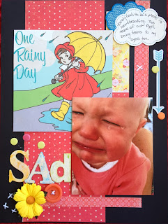
I choose to use the black for my CS with shades of orange & reds along with this saddest photo of Pippi I have ever seen!  I used an arrow to represent the spiky top, with some dots to represent her tears, & the wet path in this inspiration.
                                                                         SUSAN


Our winner for last month was Nicole.
Announcing our 2 new D.T members ,Nicole Knopke and Susan Moy.
I'm sure they will be producing some wonderful inspiration!
 
And the prize for this month,in keeping with Halloween and our theme is....
 
crochet,fabric & felt flowers, an orange vine and twine to match.
 

Thursday, September 19, 2013

A clarification

There seems to be some confusion about the September challenge and DT applications.
ANYONE can do the challenge.

If you are an Australian resident and wish to apply for the DT position as well you need to put DT after your name on the inlinkz .(For example Mary Smith DT). You still do the September challenge just the same.
Please don't forget the DT bit or you won't be considered.
These will be decided soon after the 7th October.
Hope that clears things up.
Looking forward to seeing what comes in. Julene

Saturday, August 31, 2013

September challenge and August Winner

 
Because I love blue this gateway appealed to me. Look at all that beautiful scrollwork.
I'm not sure where this was but it must be at the front of somewhere quite special.

Here's the DT inspiration for you.


When I first saw the vivid blue of the gated archway photograph for this month my mind was cast back to the time I spent on Mykonos, an island off Greece where so many of the window shutters, doors and gates are painted the same brilliant blue.
 

                                                              LIBBY

The pp under the photo and the stamps I used reminded me of all the swirls in the Inspiration photo.  The criteria was to use blue... and I used various shades of blues, keeping the background dark to mimic the Inspiration photo.
Large floral stamps were added in the lower left and to the right of the photo.  Tickets are Stampin' Up! Admit It.  Additional tickets were stamped and adhered with pop dots for dimension.  Flowers were grouped around the page title.  The flower die cut tucked under the photo and the strip below the title were embossed. Glitter gems are home made and the sketch I used is from Page Maps.

                                                                       DALE
Dale's archway is reminiscent of the window's scroll work and her paper also has that middle eastern flavour.
                                                                 JULENE
Here's a layout I entered for a challenge last month but have added it here to show you that I can scrap too. LOL
 
Debi


I choose to use this photo of my daughter framed in a big open window, perched high above the glistening water in Positano, Italy.
The blue sea is just like a gorgeous background & with some lovely pp & some lovely Flourish with A Bling, I was really happy with the outcome. 
 and our new girl on the block, Trish has made a card
The lattice work on the hat and eyelet holes above reminded me of the window.
 
**************************
 Here's what you can win this month

That's large spotted flowers, chipboard buttons,2 packs of spotted buttons and 6 packs of tiles for embellishments.Total value around $20.
                   **********************************************************
NOW THE GOOD NEWS: you have until 7th October to enter this month as I will be away until then for the school holidays.
If I can offer some great advice, please don't wait to submit until the last day. Voting is actually being done over the last 2 days of the month or in this case, the 6th and 7th .So to be considered you need to get it in slightly earlier. Of course we love to see your creations whenever you submit them.

Our winner this month was very close and required my casting vote.
Congratulations Diane Hasthorpe.
 Thanks again to Linda for sponsoring us.
A special honourable mention to Buffy and Kathleen who were an equal tie for 2nd place.

Thursday, August 29, 2013

Archiscraps Design Team Call

I'd like to welcome Trish Rheinberger to our Design Team
AND

We are searching for a new DT member (or maybe 2).

All that you need to do is enter the September challenge and when linking your work put DT after your name. Applications close on 7th October.

The other requirement is to send your scrapping resume to me at julenem54@bigpond.com .
 You must be able to provide one layout per month AHEAD OF SCHEDULE, comment on entries and participate in the voting at the end of the month. THIS IS OPEN TO AUSTRALIAN RESIDENTS ONLY.
And if I can give you some good advice...DON'T Wait until the last minute.
Looking forward to hearing from you.
                                         Julene & team

Wednesday, July 31, 2013

August challenge and flowers

Here is the inspiration picture for August
Look at all those wonderful window boxes!
This house makes me think of Switzerland or perhaps parts of England.
Our extra criteria this month is FLOWERS

and co-incidentally, our sponsor is Linda from

Here is the wonderful prize that you can win
They're all beautiful and this photo doesn't do them justice......

As a bonus, if anyone who in their first order  using code ARCHI and is an Australian or New Zealand resident,they will receive 10% off their order of flowers at www.scrappersgarden.com.au 
SO WHAT ARE YOU WAITING FOR?

 AND HERE'S LINDA'S Layout for the month
 
 
Here's some work from our DT
                                                                  
LIBBY


I was inspired by the colors (blue, cream, pink & green) as well as the stone/brick walls and flowers.  I used all these colors on my page titled, "Bloom."  To the left of the photos I used large scrallops cut from 'stones' pp as well as a strip of 'bricks' pp.  There is also bricks in my bottom photo along my flowers edge.  The background papers were misted.  An ivy border punch was used along the right and various flowers & leaves added, pulling in colors from the inspiration photo.  The gems are home made.  Sketch is Page Maps (Nov 2009).

                                                                DEBI

I loved this inspiration, the brick cottage & flowers, so I choose some KC brick pp forming part of my base along with a lovely collection of various flowers as my cluster.


                                                                    JANE


I couldn’t go past highlighting one of the lovely quaint English houses complete with cottage garden we saw everywhere on our trip around Britain.  I’ve used Sassafras papers and one of my last foldies (I was so sad to see this company fold).
                                                                     DALE
I started with a paper with pink horizontal lines to represent the building's bricks. I have a lot of pink accents from the window frames. I stamped 3 rows of pink flowers for the window boxes. Plus there are pink flowers at the base of building so I made my flowers pink. I thought the roof and drainpipe looked a grey/blue colour to me so I've used teal mist and blues in my flowers.  I put a pink ribbon vertically up the right side to represent the drainpipe. I also looks a bit like bricks.
                                                                   ANN

I have used a picture of blossoms in BW and I have hand coloured two of the blossoms in a pink. I have kept this very simple I think it brings out the colours more with the pink background and the flowers that sit in the corner


OUR WINNER FOR JULY IS SHAZZA. Congratulations and your prize will be posted today. :)