Well October is well and truly here and in order to get back to the beginning of the month for challenges, this will be a short month.
This challenge is from a friend's photo taken in Europe earlier this year.
LIBBY
The criteria for this challenge is to "add a face" on your page... which is "traveling girl" to the left of the photo. I was inspired by the colours in the inspiration photo as well as the metal design. I used orange and black papers and added spiral metal clips and a punched border which also reminded me of the architect in the photo. Various stickers are layered and clustered beside my photo and below it. Sketch is Page Maps (Apr 2007).
I was drawn to the intricate wrought iron work shown in the inspiration picture. It reminded me of some of the amazing fences and gates I saw on stately homes and castles of the United Kingdom and across various countries of Europe. The ones I settled on using were at Buckingham Palace in London. These were designed by Sir Thomas Brock for King George V and Queen Mary in 1911 so are now more than a century old. They display the Royal Coat of Arms of the United Kingdom - the lion representing England and the unicorn, Scotland.
DALE
I have the criteria of faces in that my photo shows only
faces. I have also used the colour scheme of white, black and orange. I have a
lot of black swirls too. I've added bling as the background paper is quite
glittery, the alphas have rhinestones and I have added two flourishes made of
rhinestones as well.
TRISH
My grandchildren were lucky enough to go to China last year. Here they are posing in the copies of the warriors. I used deco crackle on the urn and leaf, rubbed with gold paint over that when dry with my fingers for more control. Lots of masking, distressing, sewing and die cut flourishes to tie in with the colours of the soldiers.
and a card from Trish too
The card was embossed, the images stamped then cut out ... lace added, Martha Stewart punches and pearls added for bling ...
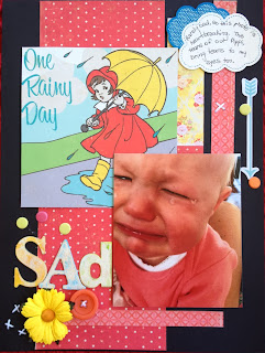
I choose to use the black for my CS with shades of orange
& reds along with this saddest photo of Pippi I have ever seen! I used an arrow to represent the spiky top, with some dots
to represent her tears, & the wet path in this inspiration.
SUSAN
Our winner for last month was Nicole.
Announcing our 2 new D.T members ,Nicole Knopke and Susan Moy.
I'm sure they will be producing some wonderful inspiration!
Our winner for last month was Nicole.
Announcing our 2 new D.T members ,Nicole Knopke and Susan Moy.
I'm sure they will be producing some wonderful inspiration!
crochet,fabric & felt flowers, an orange vine and twine to match.


Awesome examples! Woo hoo! :)
ReplyDeleteAnd a huge welcome to Nicole and Susan!! Glad to have you with us! :)